This is a collection of my favorite data visualizations I have created. As I continue to explore the world of sports data science, I will add onto this repository as I feel is warranted.
Circular Dendrogram
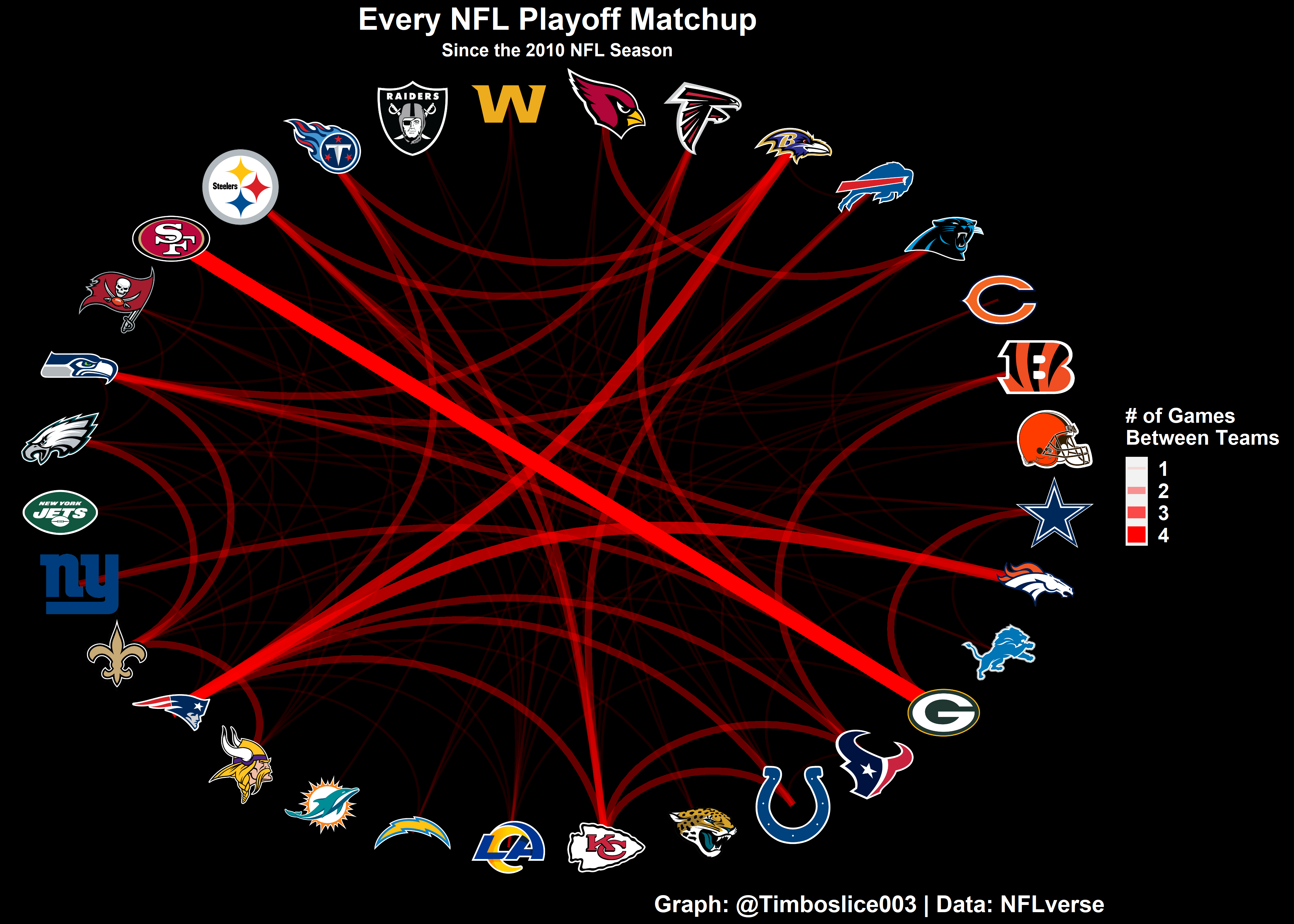
Created as part of my 2022 30-day chart challenge, this was a challenging visualization for me at the time, as I was in the early stages of learning R. I have not updated this since I created it, so this shows all NFL playoff matchups between the 2010 and 2021 seasons. The 2010 season was chosen as the starting point so all teams would be represented since that is when the New York Jets last made the playoffs.
Sports Betting Simulation
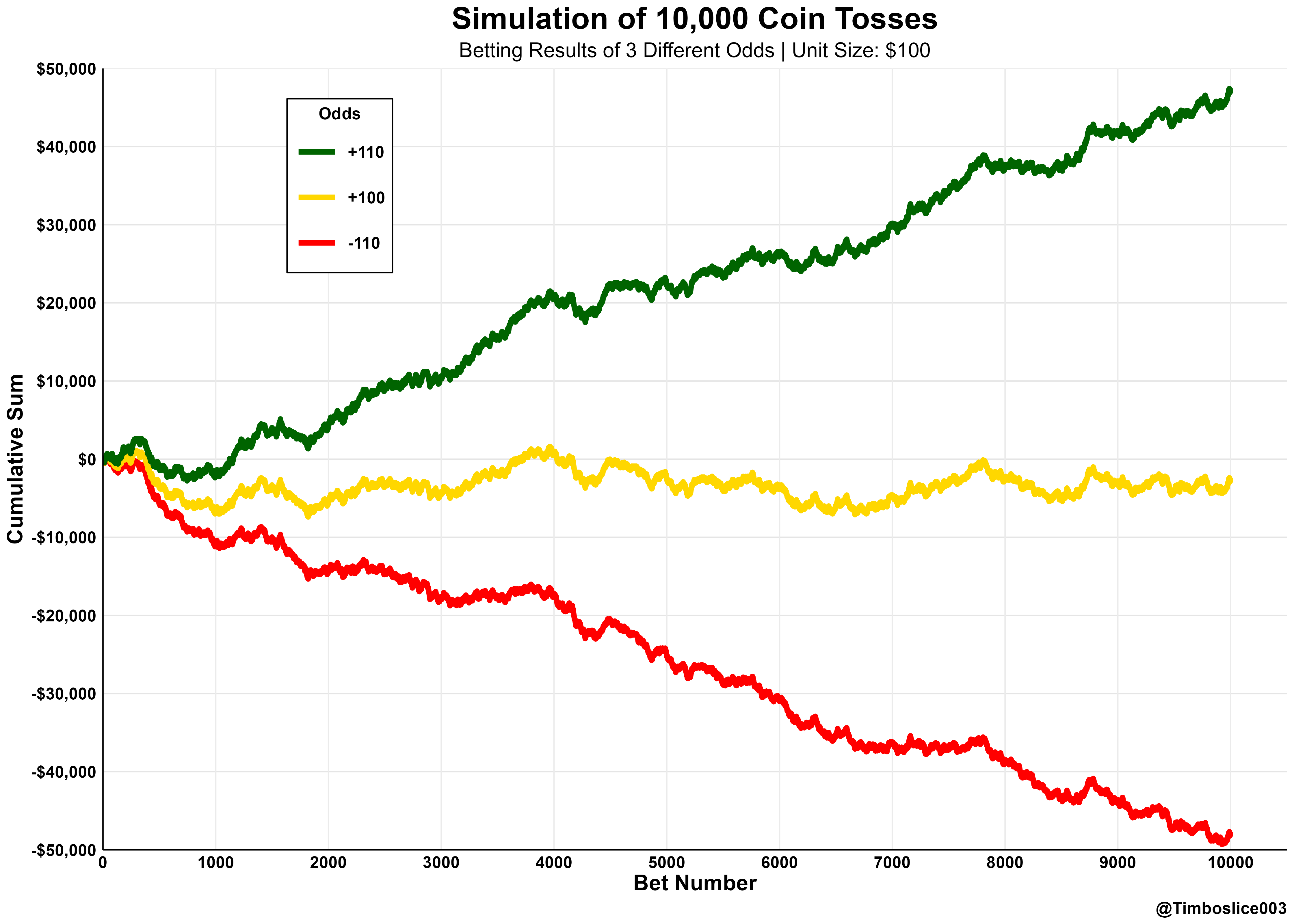
This graphic was included in my article Positive EV Betting. While it was a fairly simple graph to make, it summarizes the most important aspect of sports betting: always shop around for the best line! I also really enjoyed how the color scheme of green, yellow, and red turned out.
BetMGM Promotion Analysis
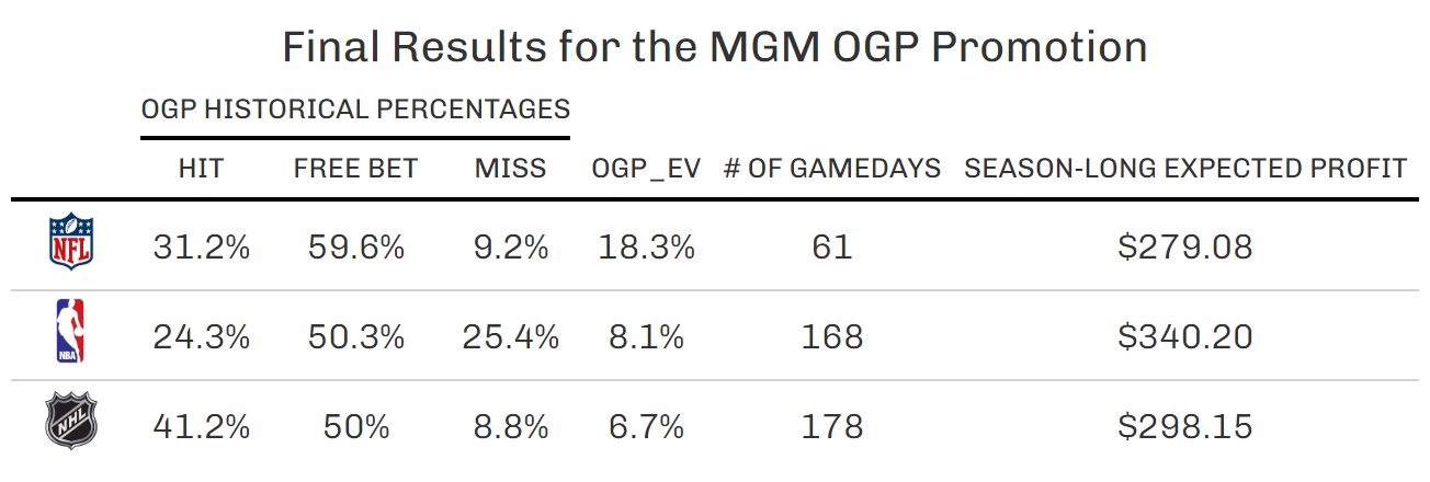
The final table of my BetMGM OGP Promotion Analysis is one of my favorites because of all the effort I put into the project. I had to scrape a lot of data from the internet, a process which was new to me at the time, and I actually used this betting strategy! To see it all come together in a simple-to-understand data visualization was a nice way to end the project.
Free Formed Data Visualization
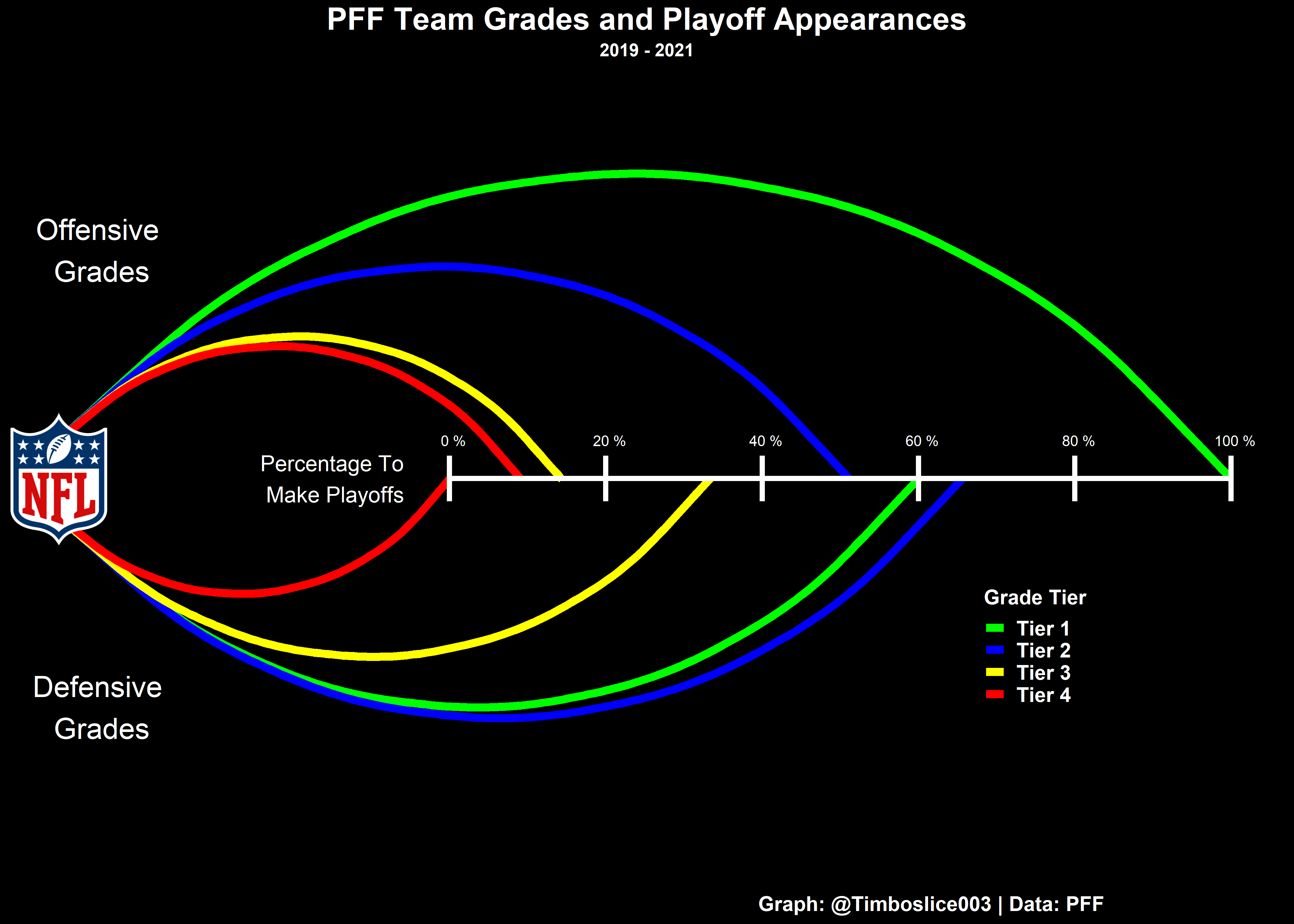
Also created as part of my 2022 30-day chart challenge, I enjoyed creating this data visualization because it did not follow a design I had seen often before. By playing around with ggplot2, I was able to create a graphic to highlight the fact having an elite offense in football is the greatest advantage a team could have.
Fantasy Football Best Ball Draft
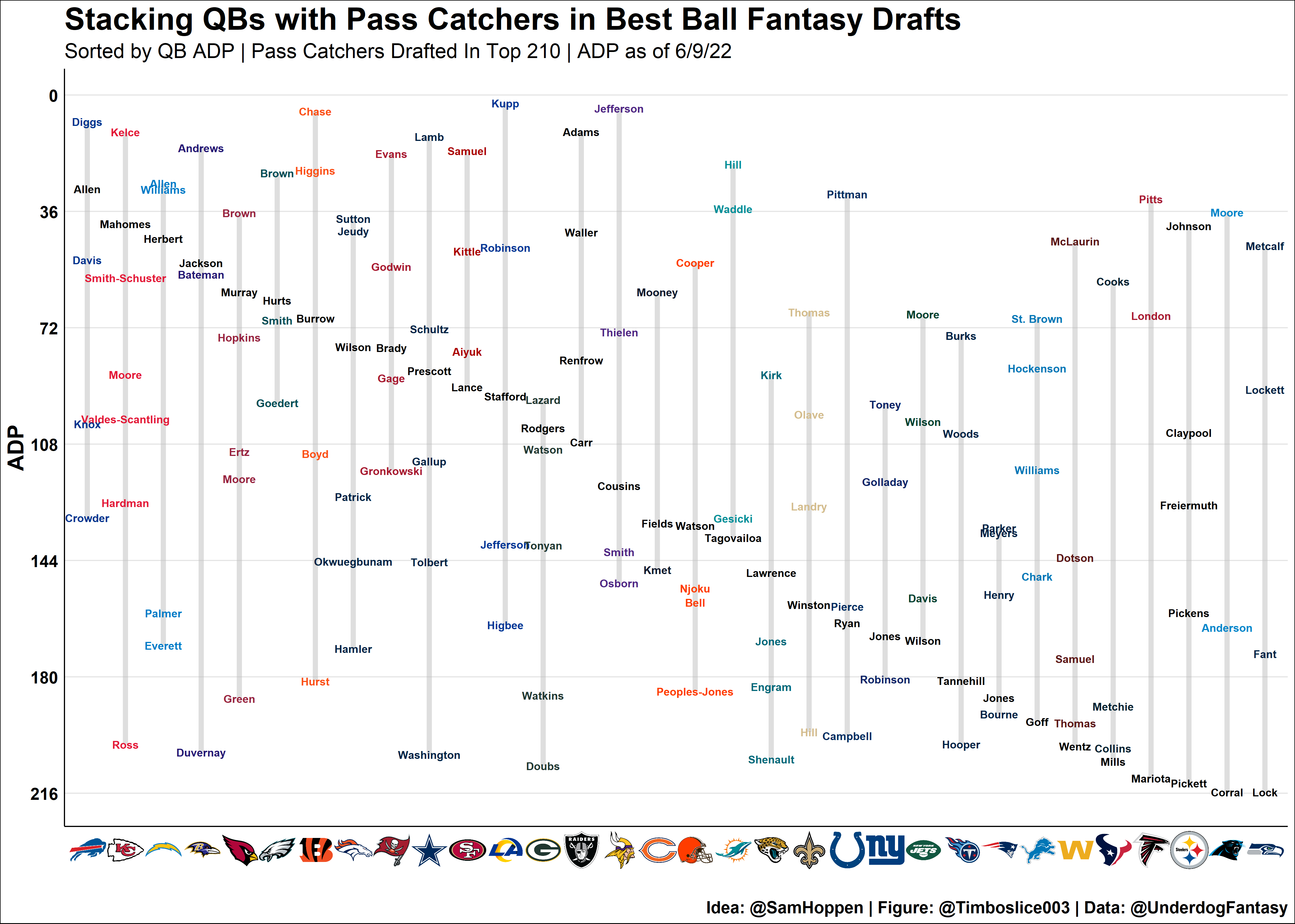
If you are not familiar with Best Ball Fantasy Football, this graphic may not make a lot of sense, but I enjoyed making it is because I saw a similar graphic on Twitter and I wanted to see if I could recreate it. When I showed the original creator my version, he actually started using my idea of the team logo on the x-axis. He was originally just using the team abbreviation but this looks much cleaner. He must have agreed!
Pro Football Focus Data Table
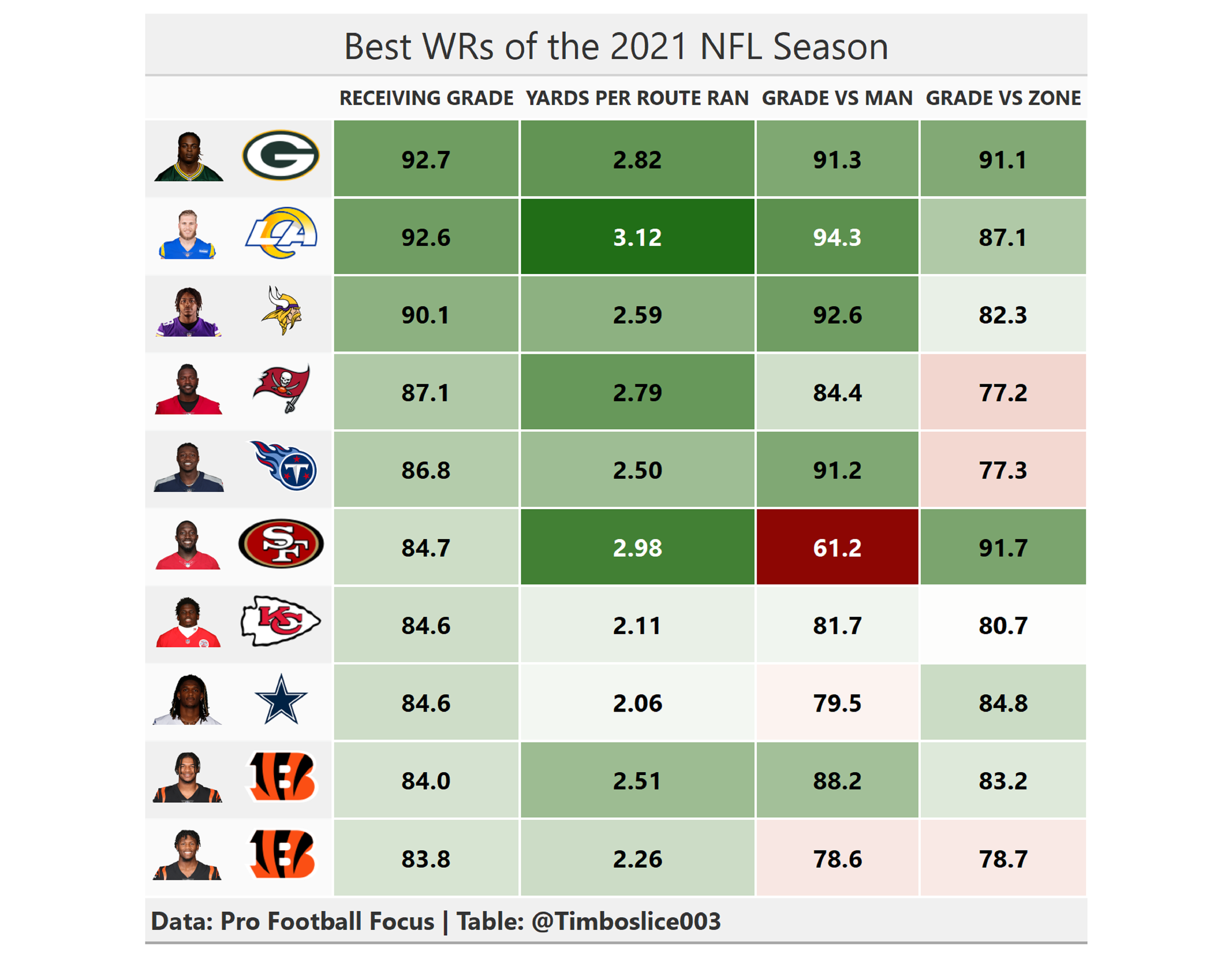
As the final creation of my 2022 30-day chart challenge, this visualization lead me to further familiarize myself with the R package gt and all the customization that comes with it. It also really intrigued me to see how NFL coaches can make the most of their players' skillsets. As the table shows, Deebo Samuel is not great vs man coverage (according to PFF), but his overall grade is still very high because the 49ers put him in situations where he faced primarily zone coverage.
NFL Team Performance Rating
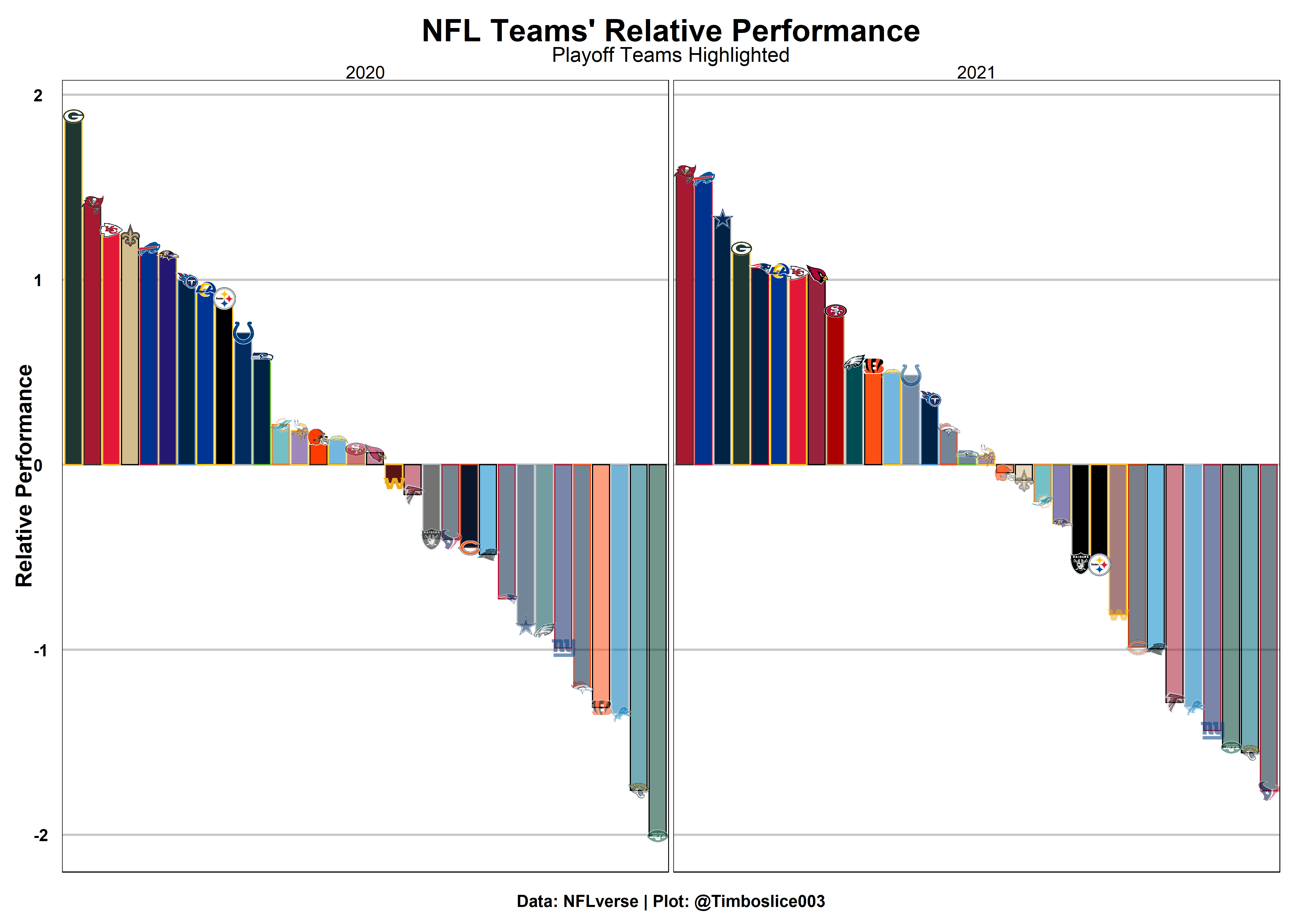
As part of my random forest model to predict NFL teams' win totals, I created a new measurement I called relative performance. It combines offensive and defensive performances and rates each team based on how many standard deviations they are from the mean. It was the most impactful parameter in the model. This graphic demonstrates how teams with a higher relative performance are significantly more likely to make the playoffs.
Model Results
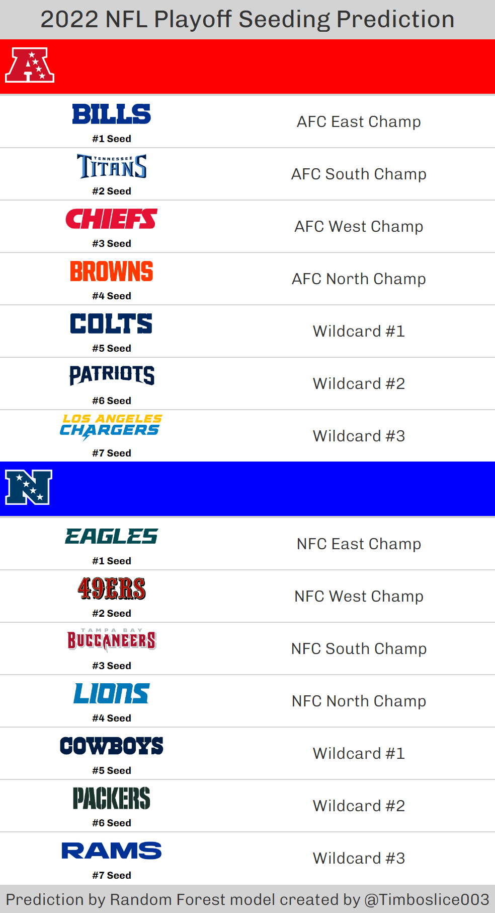
Also from my win totals article, this graphic shows the 2022 predictions of my random forest model. The model was created prior to the 2022 season, and after the season I went back to see how it performed. I was extremely satisfied with the results, as I would have returned a positive ROI......if I had bet on these teams.